50% off till Dec 1
available in all of the styles:
![]()
only available in some of the styles:
![]()
![]()
![]()
![]()
![]()
![]()
![]()
![]()
![]()
![]()
![]()
![]()
Designers: Ludwig Übele
Design date: 2008 / 2013
Publisher: Ludwig Type
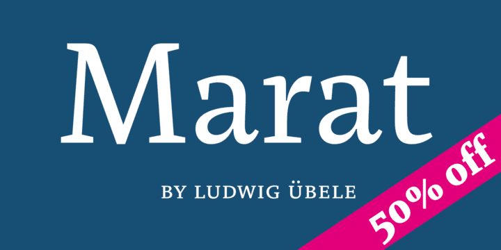
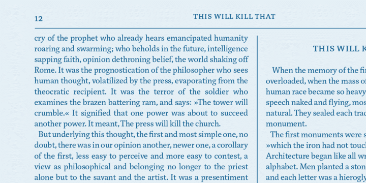
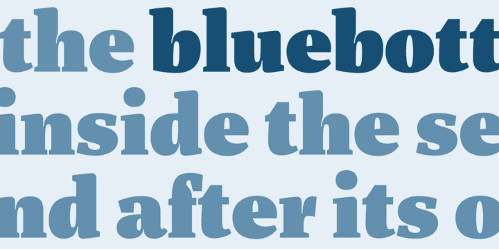
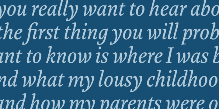
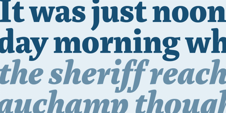
Although originally conceived as a magazine face – with strong serifs and open character shapes for good legibility in small sizes, and compact letter forms optimized for narrow columns and tight headlines – Marat evolved into a comprehensive family for general use.
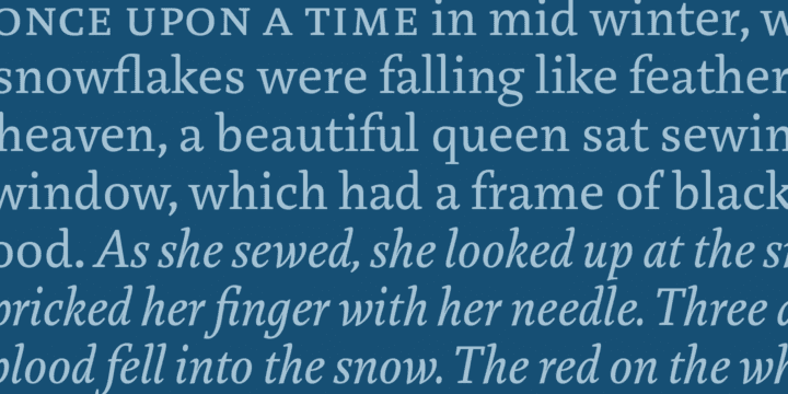
This specific construction and the round forms of the letters create a elegant, soft and friendly appearance. The typeface suits for a wide range of typography, e.g. editorial, brochures, packaging and corporate design. In particular in bold weights it works surprisingly well, which is not always the case with serif faces.
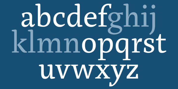
Marat includes oldstyle and lining figures (both proportional and tabular), a wide range of language support and various OpenType features (e.g. ligatures, case sensitive forms, fractions, superiors and inferiors). It is the perfect companion for Marat Sans, clean and lively sans serif typeface.
Marat has been selected by the Type Directors Club of New York to receive the Certificate of Excellence in Type Design 2008.
