Designers: Ramiro Espinoza
Design date: 2012
Publisher: Re-Type
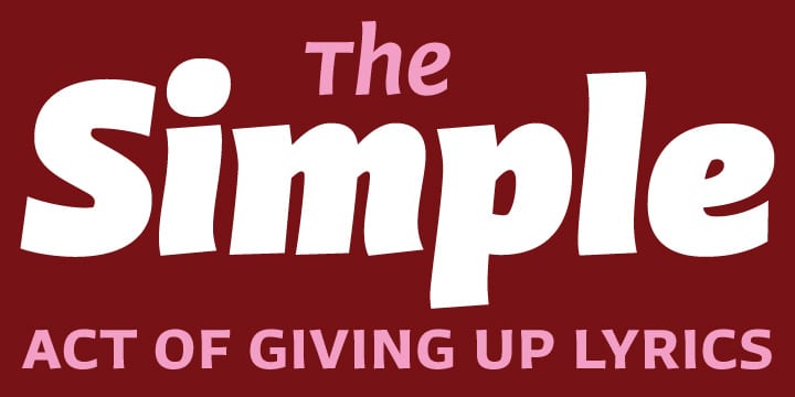
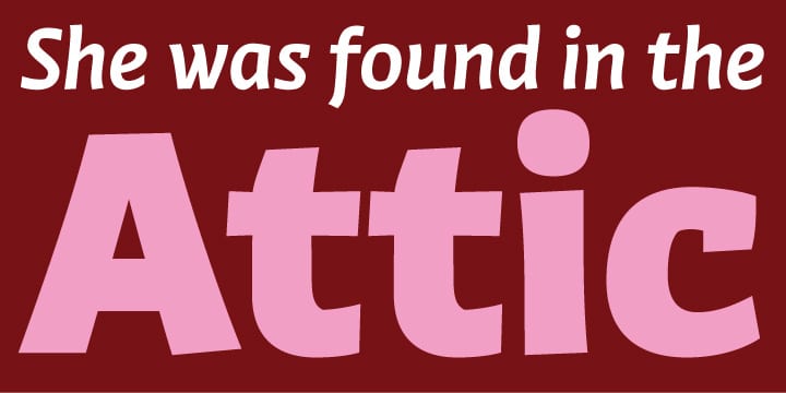
Winco family can be labelled a humanist sans-serif, but in spirit it is more closely related to that rather rare typeface category called ‘glyphic’ or ‘incise’.
While conceiving Winco, Ramiro Espinoza studied the work of the masters of postwar book cover design: Helmut Salden, Boudewijn Ietswaart, Berthold Wolpe; among others.
He also looked into German and Czech traditions of expressive printing types that had such a strong presence in the earliest decades of the 20th century.
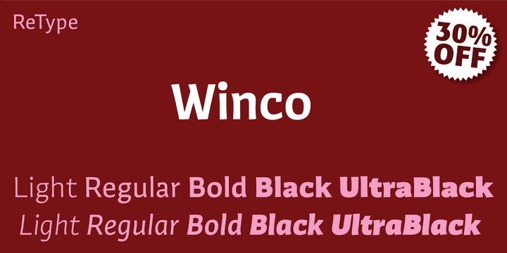
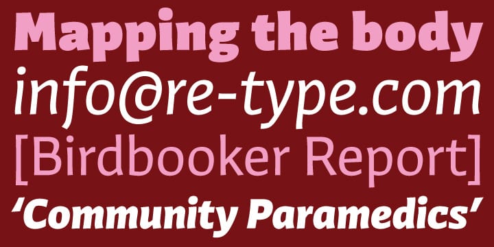
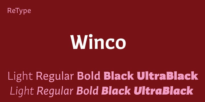
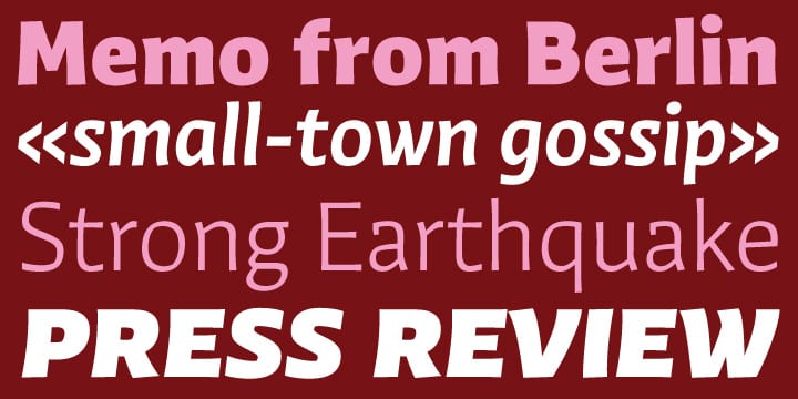
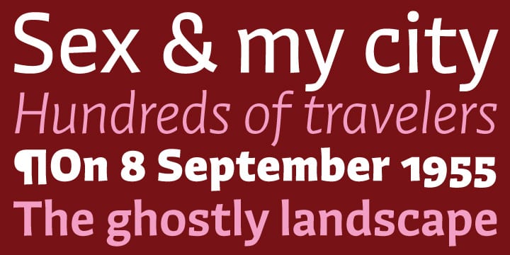
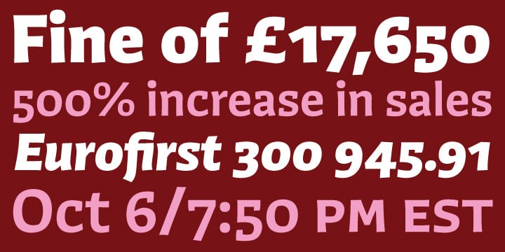
Having established a stylistic framework, Espinoza designed the typeface from scratch. This allowed him to create an original, typographically consistent and versatile family in five weights, from Light to Ultra Black. The process has resulted in a typeface that successfully combines the high legibility and seriousness of a text face with the expressiveness, dynamism and subtle irreverence of the original hand-rendered alphabets. Winco is a versatile family whose extreme weights – Light, Black and Ultra Black – make for striking headlines, while the middle weights work well in both display and text settings. Produced as CFF OpenType fonts, all weights come with small caps and multiple numeral sets, including superscript, subscript and fractions, alternate glyphs and ligatures, making Winco a typographically sophisticated family suitable for a wide range of editorial and corporate work.
