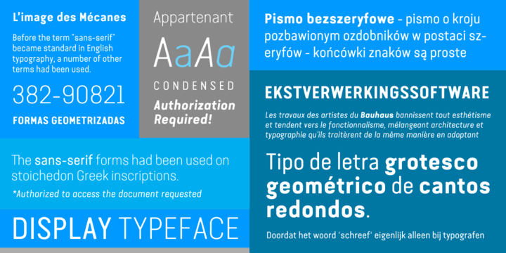
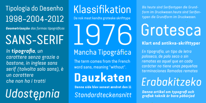
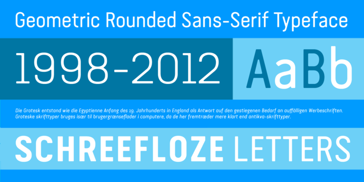
available in all of the styles in this family:
![]()
![]()
![]()
![]()
![]()
![]()
![]()
![]()
![]()
![]()
![]()
![]()
![]()
Designers: Ricardo Santos
Publisher: Vanarchiv
Van Condensed is a sans serif font family with a geometric style. The first drawings were done in 1998 but the family was not completed until 2004.
The Van condensed family has three weights: Light, Regular, Bold, all of them with an italic version. The letters have a low contrast and the x-height is medium, the ascenders and descender strokes are long which improve leading. This letters don’t have any stress between thick and thin strokes because they have a geometric and linear structure.
The associated Dingbats (included in the family package) complement this family and have the same round treatment like the typeface.
