50% off until May 31
Designers: Dave Rowland
Design date: 2014
Publisher: Schizotype
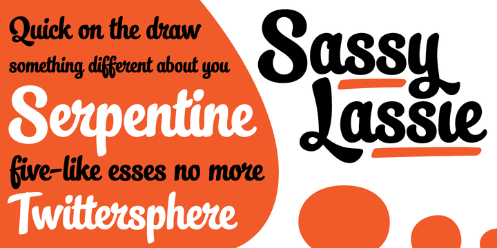
Back in January 2012, a chubby, uprightish baseball script called Streetscript made it into the MyFonts Rising Stars newsletter. Since then, it has been used for all manner of applications, far beyond the range of uses I’d anticipated.
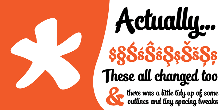
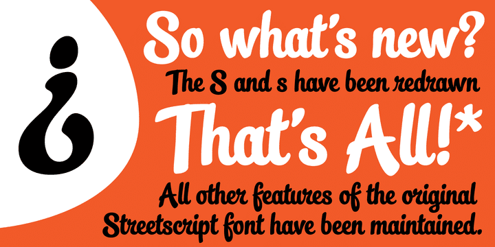
However, one thing seemed to keep cropping up. It seems a lot of users didn’t like the s’s in the font, and after seeing them redrawn (not always with the best results!) a few times, I decided to make a new version of the font with less idiosyncratic s’s, and this is the result, Streetscript Redux. (I should have listened to my other half – “those s’s look like fives,” she said)
All other features of the original Streetscript are intact (barring a couple of s-ligatures no longer necessary). There’s been a little tweaking of some outlines, and slight changes with spacing too, but for the most part, all I’ve done is redraw those pesky five-like s’s, so that you don’t have to.