60% off until Dec 4
Design date: 2013
Publisher: Anže Veršnik
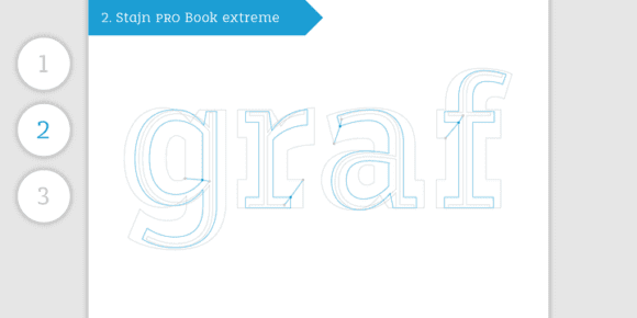
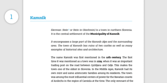
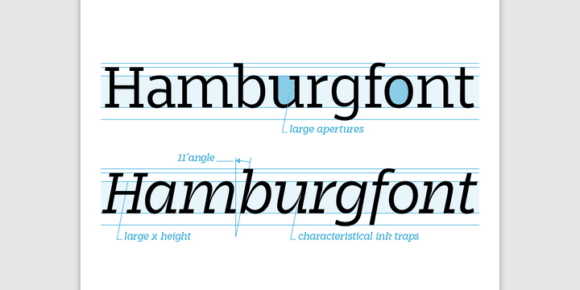
Stajn Pro was designed upon a main goal of using this typeface to set larger amount of text. The slightly condensed proportion allows for more content per page while large x height with its larger counters improves legibility and readability while used on smaller sizes.
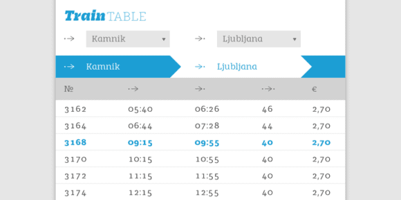
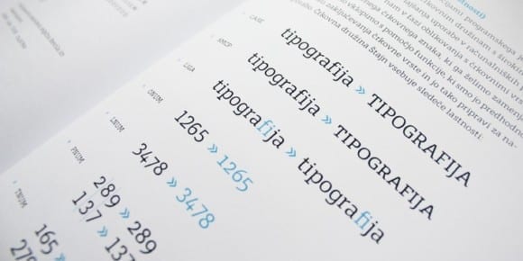
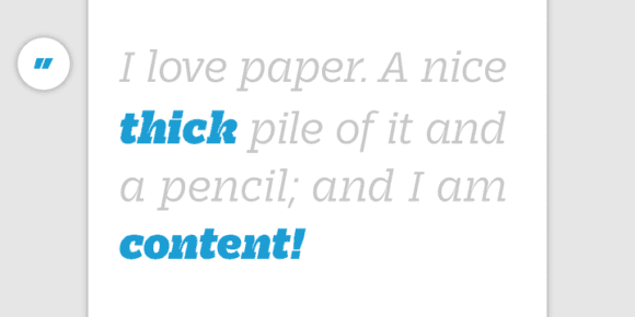
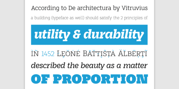
Despite the fact that Stajn Pro was designed as a body text Type Family, it works as well as a display too. Wide variety of weights as well as interesting, strong and at the same time beautiful character along with some stylistic alternate makes Stajn Pro a useful typeface in a field of editorial, magazine and promotional materials design.
The Stajn Pro character includes some humanistic typeface characteristics, which add some softness and elegance in its strong and stable presence.
