40% off until Jun 29
Designers: Manuel Eduardo Corradine,Sergio Ramírez
Design date: 2012
Publisher: Corradine Fonts
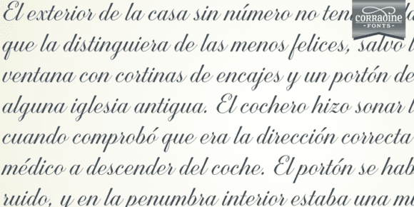
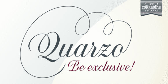
This script font is inspired by the flexible nib to create a concatenation of refinement with character mixing the contrasted strokes with pronounced but rounded angles. This angles along with the inktraps give the font a better performance when printing. Texts will have a very even rhythm due to its consistency on the stroke’s angle and spacing.
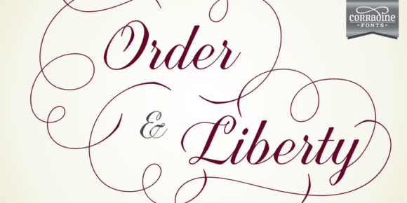
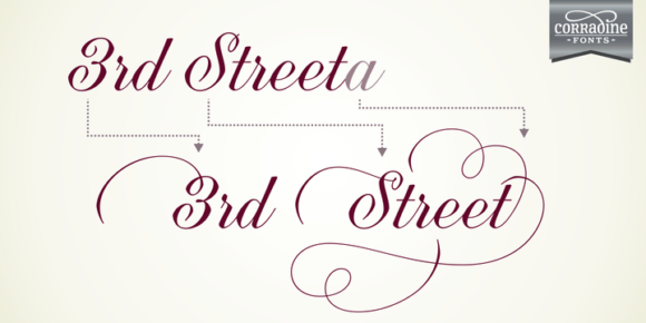
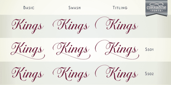
The words can receive a dramatic touch by using the wide range of glyphs with curly and refined ornamentation. There are lots of caps and number variants dressed up with a variety of swashes. Also, two sets of versatile ornaments will be found: a first set of ending flourishes that match with any lowercase letter and a second set of independent flourishes to be placed around the words.
Quarzo will give a great sophistication level to invitations, cards, tags, menus, advertising and packaging.
Its character map covers Western and Central European characters.
