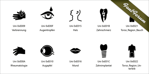
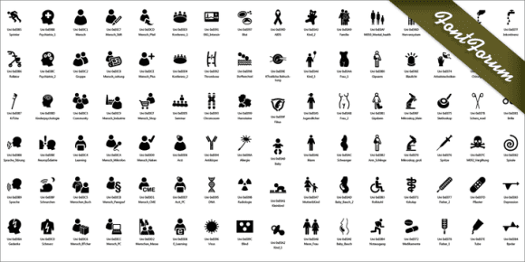
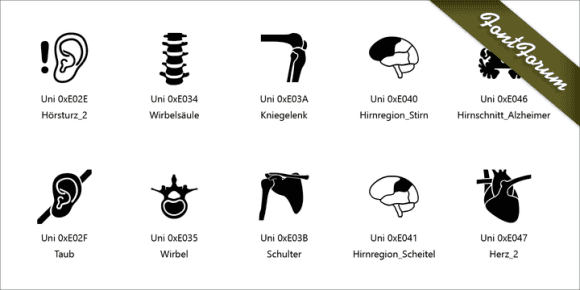
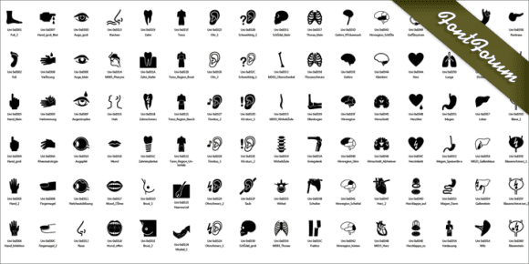
available in all of the styles in this family:
![]()
![]()
![]()
![]()
![]()
![]()
![]()
![]()
![]()
The Medical Icons have been developed at the Thieme-Verlag in Stuttgart under the direction of the graphic designer Michael Zimmermann and cover the most common medical topics. Furthermore, non-medical symbols are included also needed in the publishing world. The following considerations are guiding principles for the design:
– Miniaturization:at 15 x 15 px icons should be recognizable which of course affects the line width. Advantage of this premise is that an icon can be set in all sizes since it was designed in the smallest size.
– Uniform, simple design language
– Roundness (there are hardly any edges)
– Geometric basic forms have priority (e.g. no free speech bubble but ellipse)
– Space in front line (thus the icons can also be used as image containers and appear stronger in color. A sample – a cover for Angiology).
– they are classic, neither fashionable sophisticated nor too detailed. They can also serve as a starting point for your own developments
