Designers: Natanael Gama
Design date: 2014
Publisher: Ndiscovered
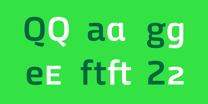
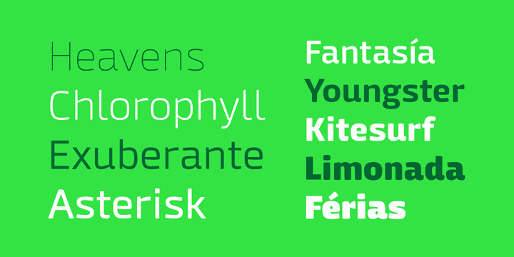
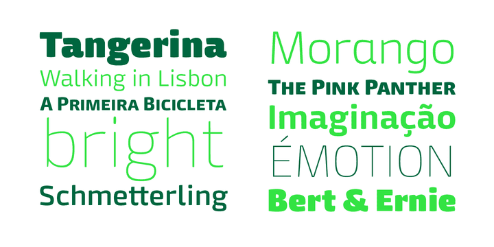
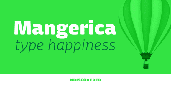
This design incorporates different styles into a consistent look. A pinch of script, a little of geometric and some humanistic shapes as well create a very distinguishable sans-serif. It has an overall good feeling especially on the heavier weights that have intended contrast irregularities to create a ‘cartoonish’ look.
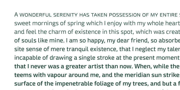
On the intermediate weights the design will preform well on small font sizes because of its large counters, low contrast and large x-height, but as you go to the extremes you will see shapes full of personality that will pop out in large font sizes.
The font is loaded with OpenType features such as small caps, ligatures, alternates, old style figures, and much more.

