20% off until Dec 12
available in all of the styles in this family:
![]()
![]()
![]()
![]()
![]()
![]()
![]()
![]()
![]()
![]()
![]()
![]()
![]()
only available in some of the styles in this family:
![]()
Designers: Neil Summerour
Design date: 2012
Publisher: Positype
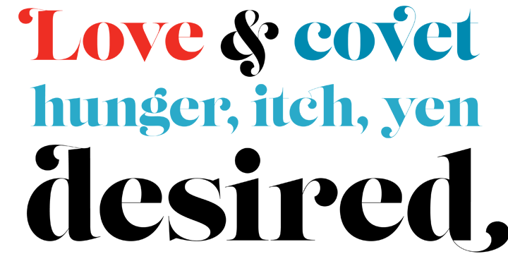
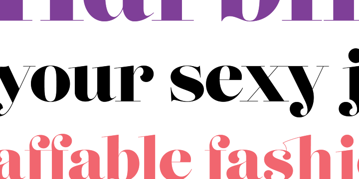
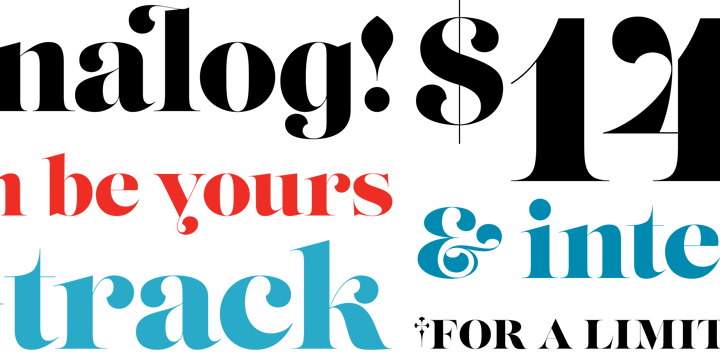
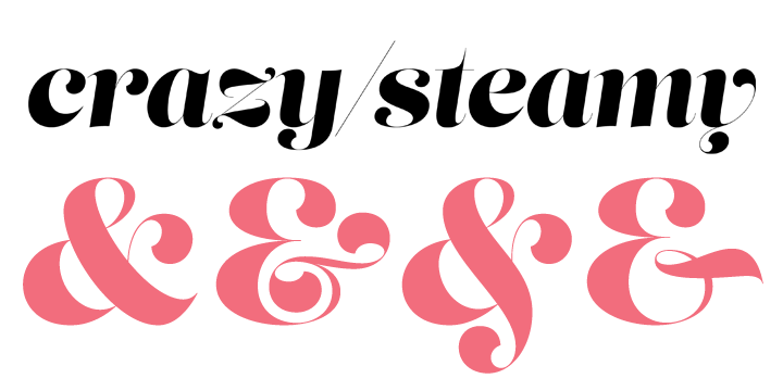
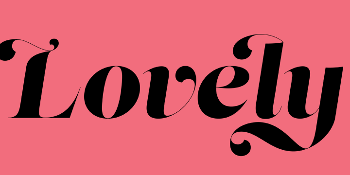
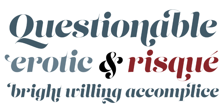
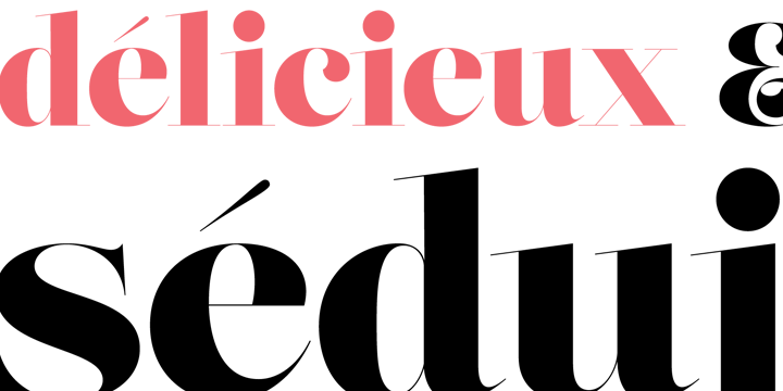
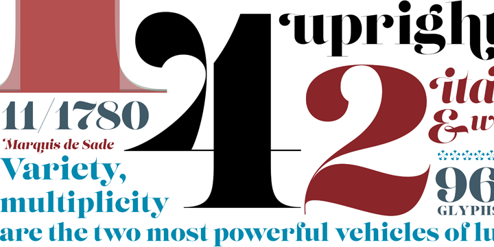
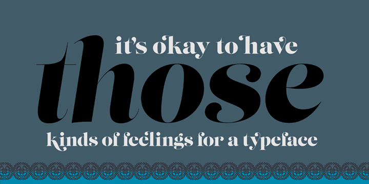
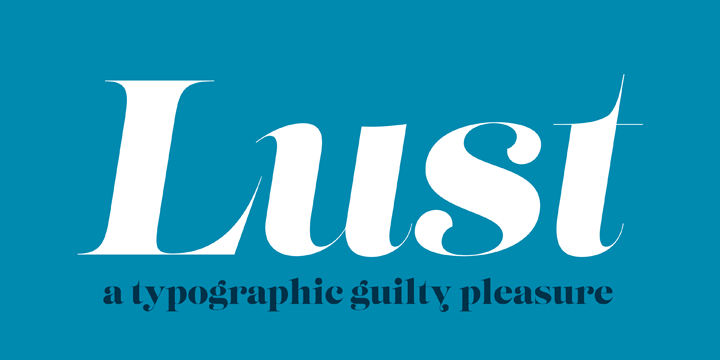
Lust is my overly indulgent attempt to infuse wanton sensuality in a typeface. I wanted to create something that was over the top but veered away from my loose “sushi” scripts, Fugu and Nori, yet was altogether reliable, without the rigidity akin to my Aaux Next series — but it had to be, well, a little sexy. The solution was to create a curvy serif. A serif would be a different endeavor for me since I consciously choose not to do many serifs — because there are so many wonderful options already! Because of this, my approach (and design) had to be different. Here’s how I broke down what I felt it needed to have under the covers to create this “lusty” typeface: Lots of contrast, almost demure, coy contrast mixed with the flowing curves of a woman’s body, incomplete, almost teasing ball terminals, and serifs that went on forever– so sharp they would draw blood if you touched them.
