30% off till Feb 8
available in all of the styles in this family:
![]()
![]()
![]()
![]()
![]()
![]()
![]()
![]()
![]()
![]()
Designers: Laura Worthington
Design date: 2014
Publisher: Laura Worthington
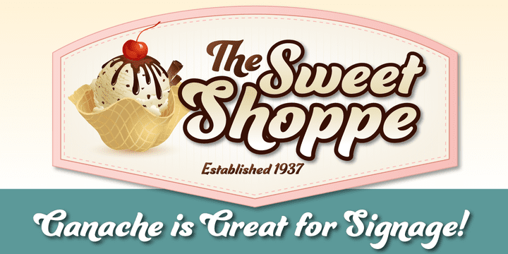
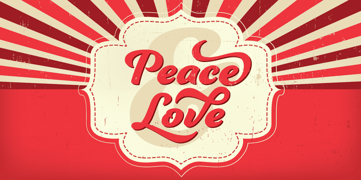
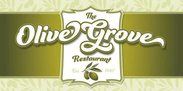
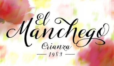
Ganache is lovely and strong—not a true script, roman, or italic, but a distinctive hybrid. It’s smart, intricate, and fun, and deceptively simple. The type designer’s fascination with letter-fitting makes this an intriguing exercise in negative space. Note the lowercase and to a slightly lesser extent, the g slides into the negative space of the n. Sit a d and a b side by side, and these two sturdy, functional letters form a soft, sweeping curve in between—a delightful morsel.
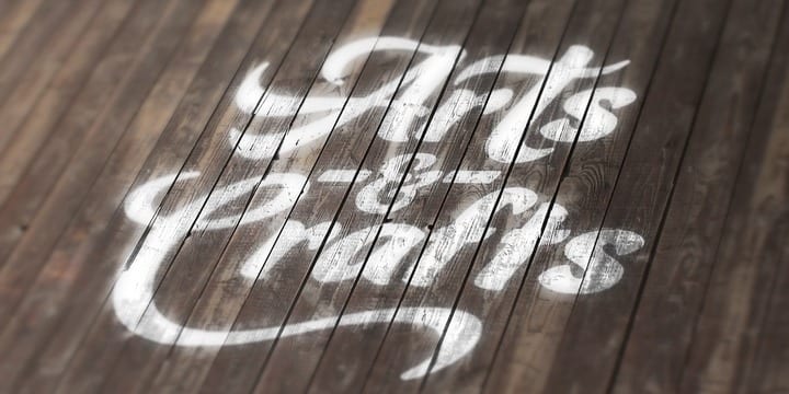
The uppercase letters are boldly stylish, and here, some of the counters display unexpected shapes. The O’s curlique tucks in to give the counter a form with the power to anchor a logo. The lowercase c echoes this in its counter. Between some letters, the negative space is transformed into a type of swash itself. Small, subtle surprises like these are sprinkled through this carefully structured typeface, giving it the power and charm to hold up in reversed out lettering (light on dark) in which the counters take on more prominence.
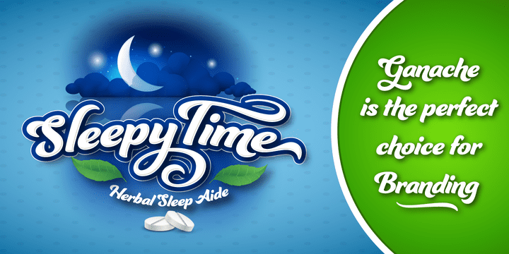
Ganache surmounts the core challenge of packaging: to achieve functional goals without the loss of interest that makes a product invisible. It finds a happy balance: a heavy, substantial text that isn’t dainty or wispy, one that says, “I’m over here!” with a dollop of sweetness and an enticing little wave.
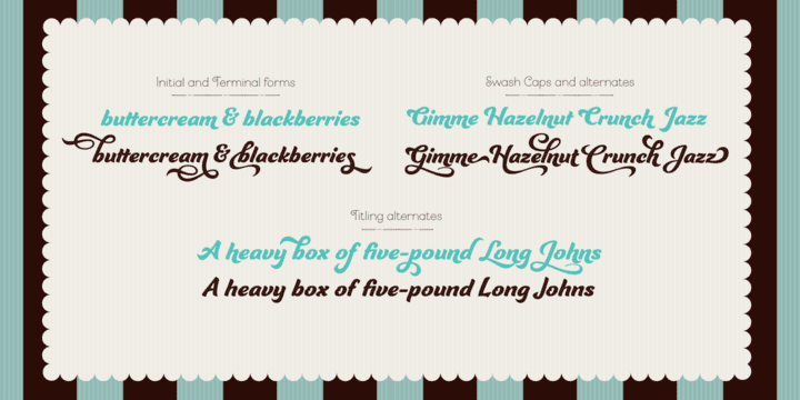
Ganache is accompanied by 185 swashes and alternates and 10 ornaments. The default has its distinctive “swashyness,” stylized but not extreme. Open Type’s Titling feature offers a simpler version, in which, for example, crossbars have a more standard roman look, and remnants of swashes are removed.