90% off till Aug 21
Designers: Michael Gene Adkins
Design date: 2010
Publisher: The Fontry
available in all of the styles:
![]()
![]()
![]()
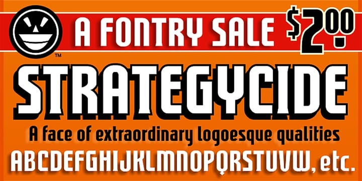
Anyone can base their font strategy on comic book letterers of old. In fact, the most commonly aped styles tend to be those from the 60s and early 70s. But what about comic book letterers of “new?” The 80s and a bit beyond?
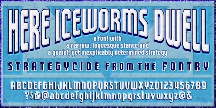
Well, I jumped forward some, give or take a decade, landing moments ahead of the computer-lettering revolution, and with no strategy in mind except maybe to do myself in on the time expenditure, Strategycide was born.
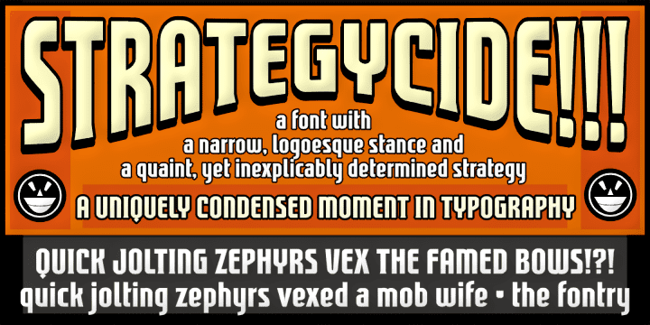
It’s got the narrow stance, the gothic style, some hidden sharpies, and it is absolutely in love with thick outlines and deep drop shadows. It’s a strong face with a clear strategy. Not one likely to hurt you or finish you off, though. That would be Strategycide.
Available in two industry-satisfying versions: CAS (Computer-Aided Signmaking) and DTP (Desktop Publishing).
