50% off until Aug 24
Designers: Alex Haigh
Design date: 2008
Publisher: Thinkdust
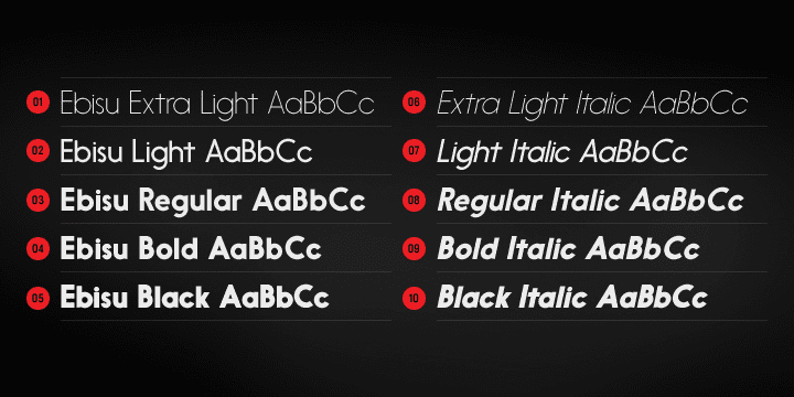
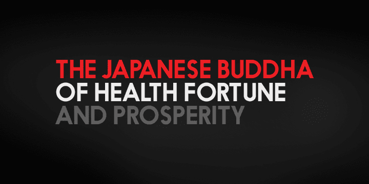
Ebisu is a sans serif family consisting of 10 different weights.
Designed by Alex Haigh in 2010, and influenced by one of his original designs from 2008 – Hiruko – Ebisu loses the soft sans serif curves, for a more robust geometric styling.
But it’s much more than a geo-replica. The lowercase characters also have a more exaggerated sharpness that gives the whole family a unique look and feel. The kerning has been individually crafted for each letter, with vigorous attention – to ensure that each letter from is produced in a way that works with every member of the set, for a tightly knit sans serif family.
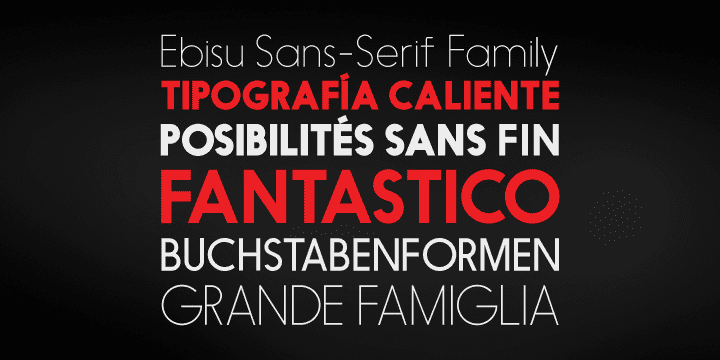
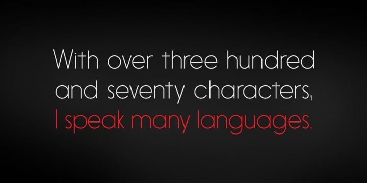
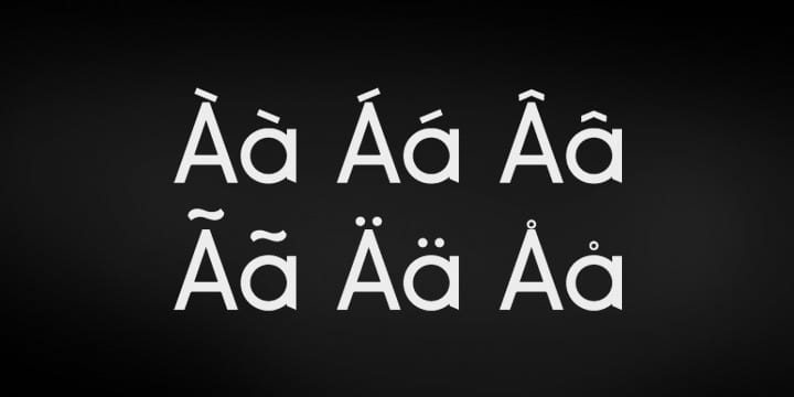
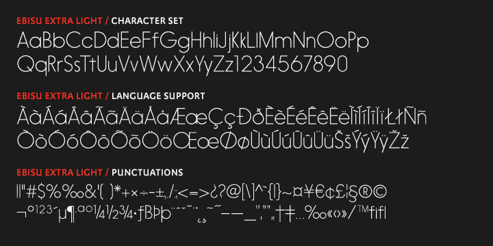
It speaks many languages too. The open type features have an extended character set to support Central, Eastern, and Western European languages. With each weight conveying a different personality, Ebisu is set to become the modern new sans serif family to sit alongside you classics for versatility, cleanliness and a crafted edge.
