96% off till Oct 6
Designers: Kent Barns
Design date: 2011
Publisher: Kent Barns
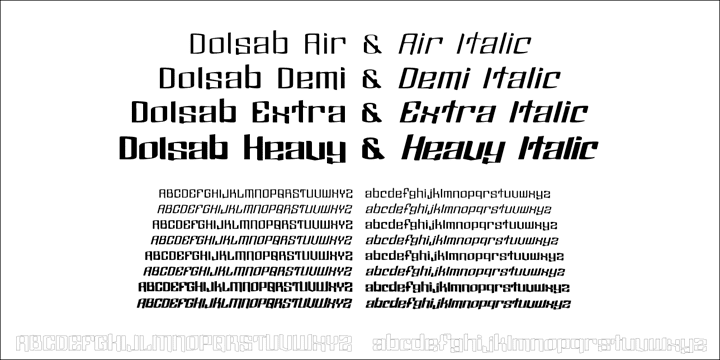
available in all of the styles:
![]()
![]()
![]()
![]()
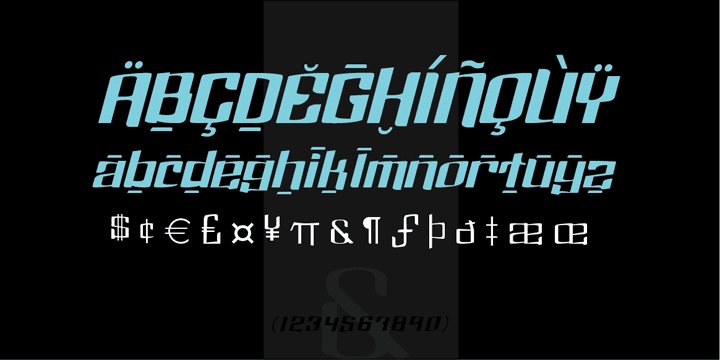
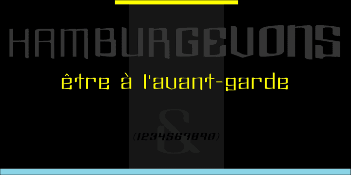
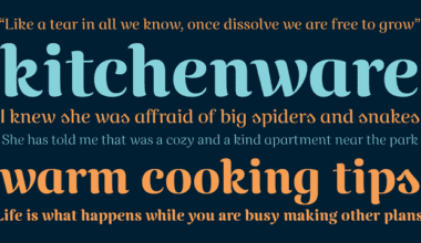
Dolsáb was designed from scratch with uniqueness in mind. The subtle movement from thick to thin and the variants of sharp to rounded make this cutting edge san serif a must have.
The inspiration for Dolsab was a simple pairing of a rhombus and calligraphy. While neither of those two elements can be seen in their entirety in any instance, the influence of both is strong. The rhombus can be notice on most ascenders like on the lowercase t & l, for example.
And the calligraphy inspiration is most easily captured on the descenders such as the lowercase y & g.
The most beautiful characteristics of Dolsab is definitely the calligraphy-influenced movement. These features really stand out on the lowercase a & e. It’s almost amusing to let your eye follow the contours of those two letter forms as they travel from thick to thin, sharp to rounded and back again.
Users are welcomed to try all font styles of Dolsab in any applique of their choosing. However, it will be quickly noticeable that only Dolsab Air & Demi (the thiner of the styles) will be best suited for body copy. Personally I like to see these letterforms as large as they can be to really showcase the subtle movement, especially in Dolsab Heavy where these movements become much more dramatic.
You’ll never know what really works best unless you experiment. Dolsab surely isn’t the answer to all projects, but it’s certainly worth trying.
No other typeface moves quite like Dolsáb.

