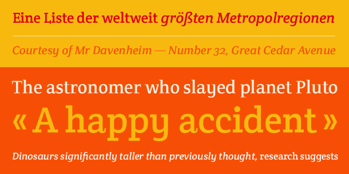
available in all of the styles:
![]()
![]()
![]()
![]()
![]()
![]()
![]()
![]()
![]()
![]()
![]()
Designers: Veronika Burian
Design date: 2007
Publisher: TypeTogether
A typeface originally inspired by a wall lettering in a small chapel on Crete, Greece.
Despite its experimental character it works nicely in a text environment. Crete is perfect for display use where a feminine and elegant touch is desired. The unusual serifs and terminals add to the graceful appearance in the Thin and provide a more robust feel in the Thick.
Both weights are metrically interchangeable, so text will not reflow when mixed. The accompanying Italics have several different lettershapes and therefore have, in some cases, their own widths. However, they sit comfortably next to the uprights.
The style names refer to the change in serif weight instead of increasing vertical stem widths.
Crete features our Basic Extended character set including four sets of numerals, ligatures. fractions, superior/inferior numerals and language support for over 40 languages that use the Latin script.
Crete was selected as winner of the Granshan competition 2008 in the display type category.
