50% off till Mar 18
available in all of the styles in this family:
![]()
![]()
Designers: Harald Geisler
Design date: 2010
Publisher: Harald Geisler
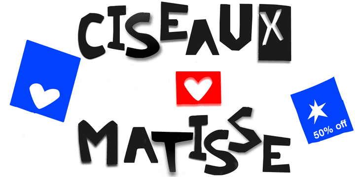
Ciseaux Matisse was inspired by the exhibition Drawing With Scissors, which I visited at the Kunsthalle Schirn in my hometown of Frankfurt am Main in 2003 and the book Jazz published in 1947 by Henri Matisse.
Admittedly, before that time I wasn’t a fan of Matisse’s work, neither his late nor the early work. That definitely changed after the exhibition. While his motifs have been overused on postcards and mouspads, in front of the originals you forget those tiny pictures. Some of the works were massive—larger than 24ft. By cutting directly into the color Matisse created shapes with strong dynamics.
Years later, in 2007, I used that inspiration to cut an exclusive font for a newspaper that I designed at that time (see Gallery Pictures). Later I developed that font into the four styles featured here.
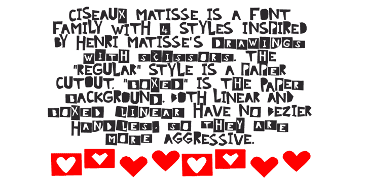
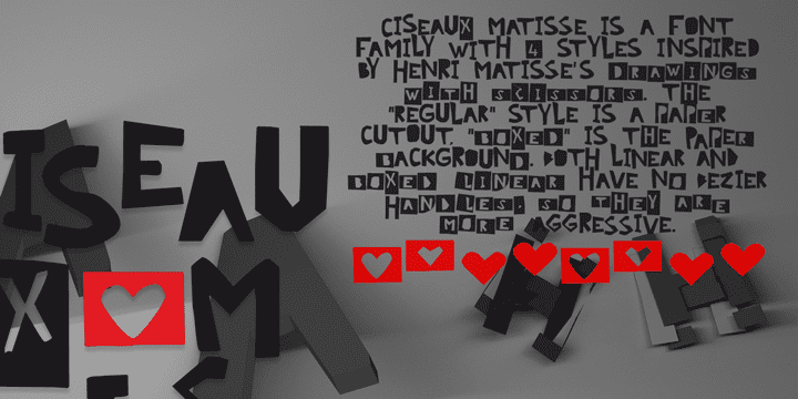
The cut-out style is a paper cutout; boxed is the paper background. Both linear and boxed linear have no curved outlines, so they are more aggressive.
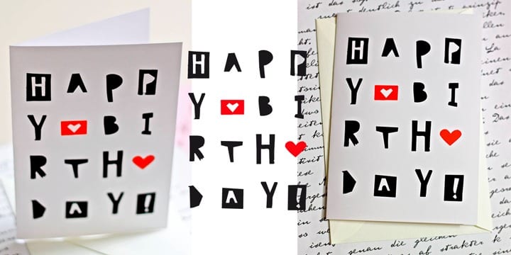
As drawing with scissors implies, all characters are cut by hand. With only uppercase letters, this font is designed for editorial use:
headlines, slogans in ads, or musical usage in posters and flyers that need the little touch of the jazz scissors.
In special cases the lowercase letters contain alternate shapes to the uppercase forms.
