85% off until Jul 26
available in all of the styles in this family:
![]()
![]()
![]()
![]()
only available in some of the styles in this family:
![]()
![]()
![]()
![]()
![]()
![]()
![]()
Designers: Rene Bieder
Design date: 2014
Publisher: Rene Bieder
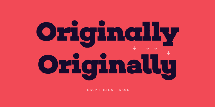
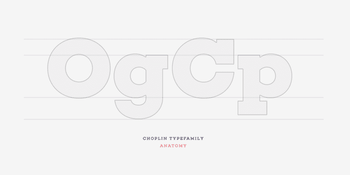
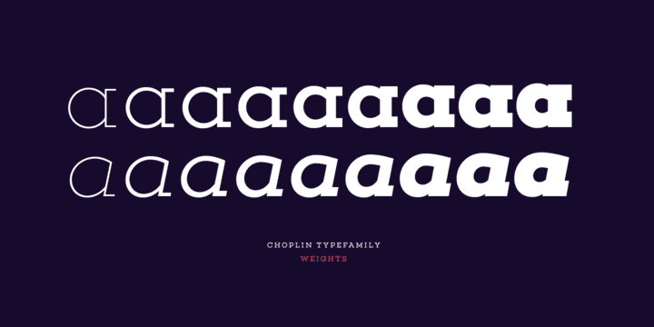
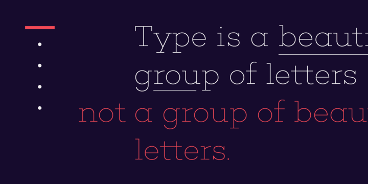
Choplin is a modern and clear geometric slab serif with a sturdy heart. It was designed based on the Campton Family, with the same principles in mind: geometry, simplicity and neutrality. As a consequence, Choplin could be seen as an immediate companion to the Campton Family. However, during the process lots of details were changed in order to sharpen the slab serif character which resulted in a slightly different interpretation.
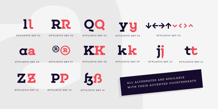
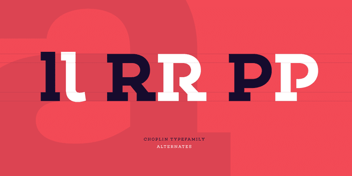
Similar to Campton, it is perfectly suited for graphic design applications ranging from editorial, corporate, web, interaction to product design. In addition, it has an extended range of alternative glyphs, ligatures and opentype features which provide flexibility and uniqueness wherever it is placed.
