available in all of the styles:
![]()
![]()
![]()
![]()
![]()
![]()
![]()
![]()
![]()
![]()
![]()
![]()
Designers: Veronika Burian, José Scaglione
Design date: 2008
Publisher: TypeTogether

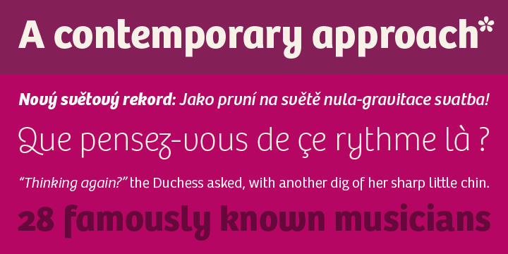
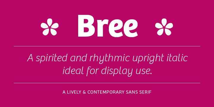
Bree, based on TypeTogether’s logotype, is a sleek sans serif that delivers a polished and modern look and feel for branding or headline usage.
Some of its most characteristic features are the one-story ‘a’, the cursive ‘e’, the curves in the outstrokes of ‘v’ and ‘w’, the flourish ‘Q’ and the fluidity of shapes on ‘g y z’. Alternate letters of these are available when a more classical look is desired.
Clearly influenced by handwriting, Bree shows a pleasant mixture of rather unobtrusive capitals and the more vivid lowercase letters, that give the text a spirited and lively appearance. It is definitely a memorable upright italic!
Bree features four sets of numerals, ligatures, alternate characters, fractions, scientific superior/inferior figures and language support for over 40 languages that use the Latin script.
