30% off till Dec 16
Designers: Jan Schmoeger
Design date: 2008
Publisher: Paragraph
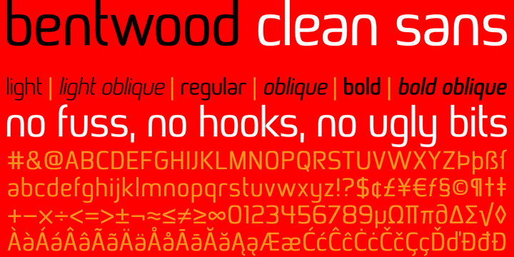
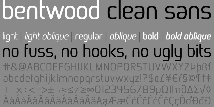
This font takes its name and the overall shape from modern bentwood furniture, namely Scandinavian designs since the 1940s. The curved corners of the letterforms are practically hyperbolic, to convey the tension and strength of the bent plywood. These curves are meant to appear more dynamic than circular or elliptical segments of traditional sans serif fonts.
The letterforms are simplified, without extra corners, stems, connections or hooks, yet remain legible at any size.
Now at version 2, Bentwood contains Central/Eastern European, Baltic and Turkish character sets and more ligatures with Open Type functionality. Some minor corrections were made to letter shapes and positions, as well as to kerning and spacing.
