available in all of the styles in this family:
![]()
![]()
![]()
![]()
![]()
![]()
![]()
![]()
![]()
![]()
![]()
![]()
Designers: Akira Kobayashi
Design date: 2011
Publisher: Linotype
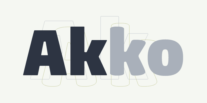
Akko is named after its designer, Linotype’s type director Akira Kobayashi, who began working on the type family in early 2010. “I originally planned to design a sans serif font with rounded corners,” he explains. “But then I became attracted to the idea of an industrial, engineered design, something similar to the rectilinear form of DIN Next™, but with curved strokes and soft proportions.”
By combining the austere industrial concept with the softer, friendlier aspects, Kobayashi managed to create two typeface families in one: Akko and Akko Rounded. Both can be seen as a stylistic blend of two extremes — the restrained and functional DIN Next and the organic, informal Cooper Black™.
The characters of Akko and Akko Rounded are characterized by simplicity and compactness; they provided a stylish solution whenever space-saving becomes an issue. For this reason, Akira Kobayashi paid particular attention to the design of the counters and the junctions between strokes. The softly rounded diagonal strokes in letters such as A, V, K, v and y ensure that no dark areas are produced within texts. The appearance of text set in these fonts is thus homogeneous, straightforward and warm.
Akira Kobayashi has been working as Type Director at Linotype since 2001. He has reworked and enhanced many major typeface families, collaborating with Adrian Frutiger on Avenir® Next and with Hermann Zapf on Optima® Nova, to name but a few of his projects. Published in 2011, the Akko™ font family was the first Kobayashi original in quite some time – it has been worth the wait.


