30% off till Dec 5
available in all of the styles:
![]()
![]()
![]()
![]()
![]()
![]()
![]()
![]()
![]()
Designers: Neil Summerour
Design date: 2010
Publisher: Positype
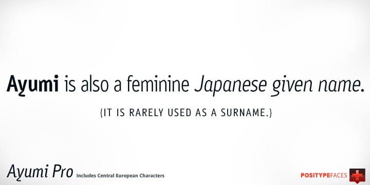
Ayumi is one of those precocious sans. At first glance, I wanted it to look simple…basic characters, moderate modulation, common structure…but at closer inspection, it is filled with all kinds of fun and expressive details. The italics are…well, fun. They’re curvy and expressive and truly compliments the face. The new Pro version includes a tightened character set, Central European glyphs, and remastered kerning.


