40% off till Feb 28
available in all of the styles:
![]()
![]()
![]()
![]()
![]()
![]()
![]()
![]()
![]()
only available in some of the styles:
![]()
![]()
![]()
![]()
![]()
Designers: Neil Patel
Design date: 2013
Publisher: Greyletter
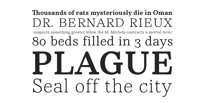
Named after the steadfast doctor from Albert Camus’ The Plague, Rieux is an even-tempered slab-serif that is confident without being cocky and approachable without being casual.
The aesthetic of Rieux is inspired by the industrial age. While the design is not directly derived from typefaces of that era, the shapes of letter-forms are informed by images of over-sized steel machines and the monolithic brick buildings that housed them.
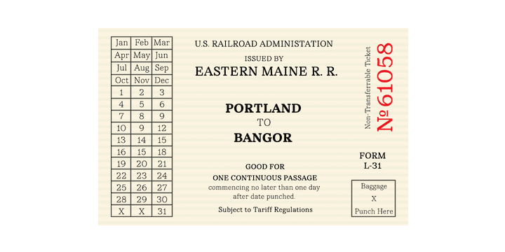
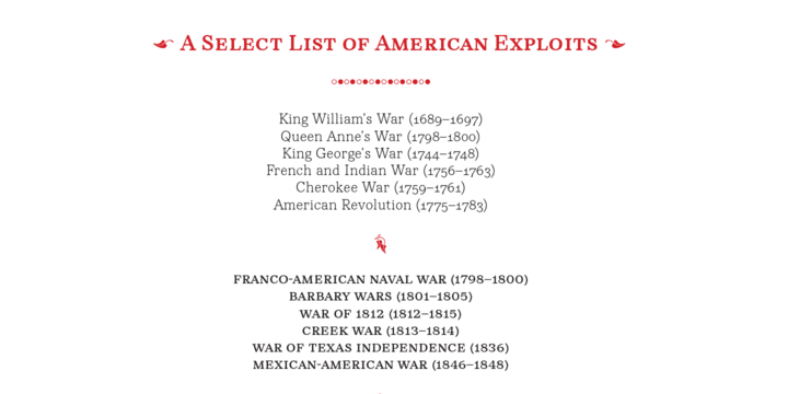
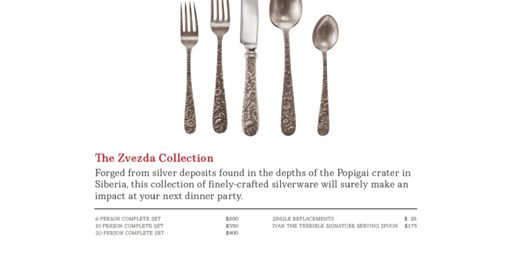
Rieux is available in 5 weights and is ideal for uncatalogued, magazines, short publications and company collateral. In addition to supporting Western, Central and Eastern European languages, Rieux includes an array of OpenType features to provide a range of typographic options.
For applications where the typographic needs are not rigorous, a reduced character set version of Rieux is available. Called Rieux Minus, this version does not include any of the OpenType features with the exception of ligatures. The language support, however remains unchanged.
