30% off until Aug 10
available in all of the styles:
![]()
![]()
![]()
![]()
![]()
![]()
![]()
![]()
![]()
Designers: David Quay
Design date: 2010
Publisher: Re-Type
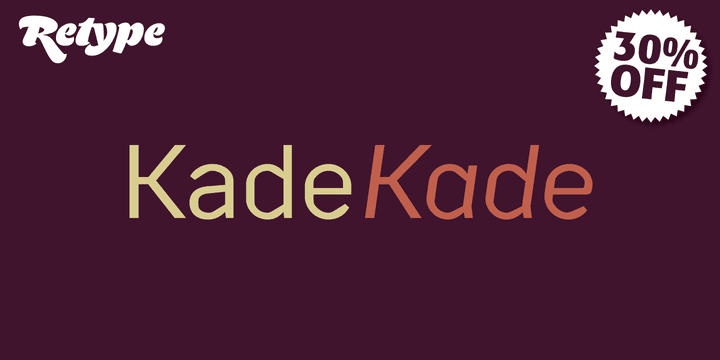
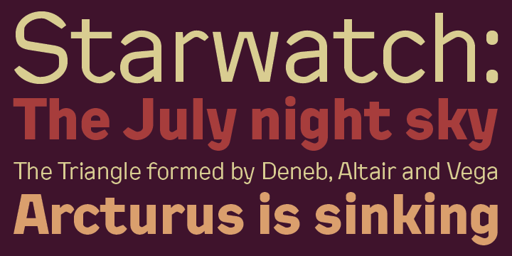
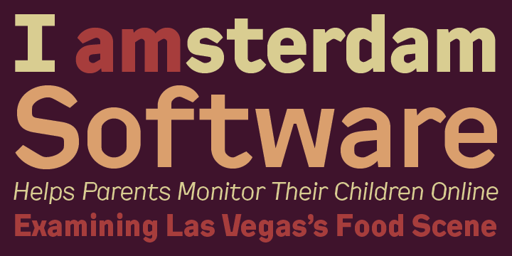
Kade is a display/semi display sans family of fonts based on vernacular lettering photographed over the last ten years in and around the harbors of Amsterdam and Rotterdam. Hence the name Kade that translates into English as ‘quay’, also the name of its designer.
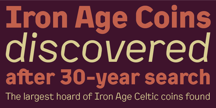
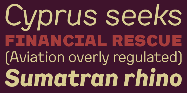
Kade grew slowly from many different ideas and elements. The letters reflects the industrial method in which they are cut for the side of ships from large steel plates. Frequently subtleties of curves are compromised due to the cutting tools and the fact engineers are in control. Kade’s italics have an experimental character and were produced in an unorthodox manner by rotating 8 degrees, rather than slanting the roman characters, a method sometimes employed in shipyards.
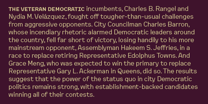
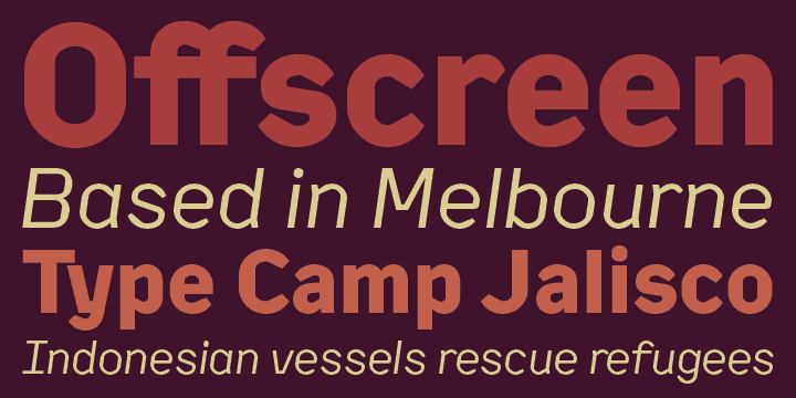
Kade constructed character is ideal for contemporary editorial works, architecture magazines, museums communication and posters.
The six distinct styles are published in OpenType format, featuring small caps and four sets of numbers (proportional old style, tabular old style, proportional lining and tabular lining), as well as matching currency symbols and a complete set of fractions.
